Logo Minimalims – Trendy 2020 : Sipmle but not normal
Logo Minimalims – Trendy 2020 : Sipmle but not normal
Minimalism style appeared from the 60s and 70s in the US and started to become a trend that lasts until today.
Minimalism is a minimalistic design that removes cumbersome details, colors but does not lose the message information to convey . Therefore, many big brands have adopted such as Mc.Donal, Pepsi, Nike, Amazon, … ..
What is a Minimalims Design ?
From a design perspective, minimalism means minimizing redundant details. Every design detail including color, shapes and typography is only used when needed. Because the human eye and brain are only attention to certain details.
Therefore, the minimalims design easily attracts the eyes of the viewer and impresses in their memory. The Minimalims style can be seen gradually taking over the design market. Not only in logo design but also widely applied in posters, packaging, websites … ..
>>>> See more : Black & White Colletion – Firts Priority from desinger
How to create a minimalims design?
As little as possible: extrude unnecessary, fussy details. Focus only on the brand’s name and a simple logo design that still conveys the message of the brand.
Limit the use of fussy colors: most Minimalims trendy designs usually only use 1-3 colors and tones not too prominent. Common colors are nude, beige, white, black, ….
Clever use of Tygography: Tygography is also known as the art of arrangement and printing techniques. In the trend of minimalims, fonts will not be too fussy. Easy to read, easy to convey content is one of the essential elements for minimalism.
Choose reputable place: Although simple, but not means sketchy, loses the characteristics of a brand
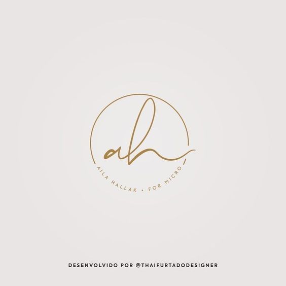
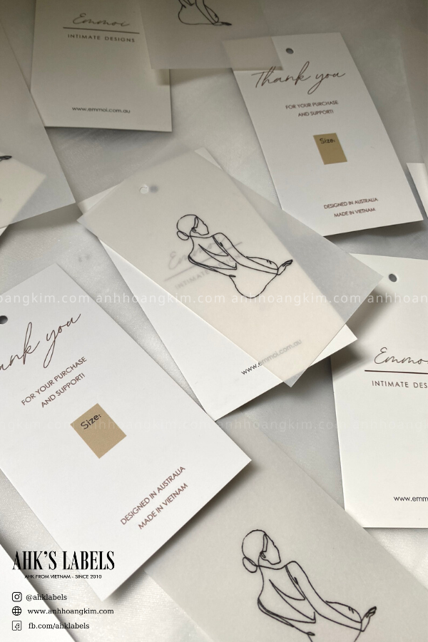
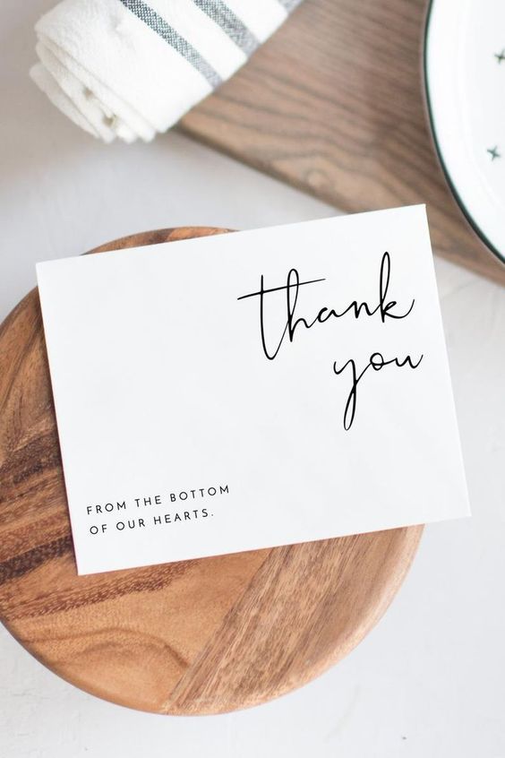
 Let’s refer to some of these Minimalims logo designs with AHK:


At AHK, with a professional and dedicated design staff, you will always support your logo ideas and design for free. Any questions please inbox directly page for online consultation 24/24.


